
Opportunity
Ghanaians have a saying.. early to bed, early to rise, and with the traffic that most workers need to face during their morning commute, workers end up needing to leave home as early as 6 am to make it to their respective workplaces on time, hence skipping breakfast which is the most important meal of the day.
Despite a plethora of restaurants offering lunch on demand, breakfast options across the country are not as many, and to secure a meal, one has to deal with long lines and the awkward transportation of these street meals. This allowed us to explore ways to offer healthy breakfast food options to the population.
How might we enable Ghanaian corporate workers access healthy breakfast options to help save them time start their day
Roles
This is a project where I assumed the following roles:
- Technology Consultant
- User Experience (UX) Designer
- User Interface (UI) Developer
- Hiring Manager
Deliverables
.
Interaction Design: High-fidelity interactive prototype for key tasks:
- Usability tests and findings
- User surveys and one-on-one interviews
- User personas and Journey maps
- Task flows
- Low fidelity wireframes
Project Tools
Project timeline: 6 months
- Figma
- Miro
- Adobe XD
- Canva
Problem exploration and research
To fully understand the scope of the problem and identify the pain points faced by the Ghanaian corporate market, two ethnographic research methods were employed:
In-Person interview
A sample size of 10 corporate workers, including men, women with children, and bachelors were interviewed in their offices to gain insights from customers.
Questionnaires
A sample size of 50 corporate workers was the target, and a google form was sent out to gain both quantitative and qualitative insights into the market. this method was adopted to gain insights faster and on a bigger scale to save the client time.
Questions asked include:
-Do you eat breakfast?
-What prevents you from eating breakfast
– What time do you wake up and have to go to work?
– Do you make breakfast at home or buy from outside vendors?
– What is your favorite breakfast, and how easy is it to get it?
-Do you order breakfast from apps
-Walk me through your morning routine
-Have you used an app like uber eats/ bolt foods to order food before?
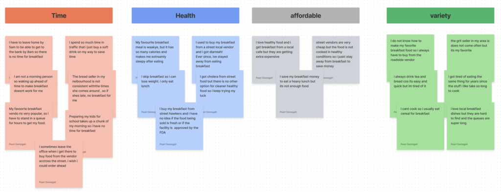
Research findings
-50% had ordered food from apps but never ordered breakfast before
-25% buy food from street vendors every morning
-70% skipped breakfast most weekdays but ate breakfast on weekends
-50% did not know how to prepare local breakfast dishes
-76% had gotten sick from buying breakfast from vendors on the street
I used card sorting to group findings from customers in themes by utilizing stick notes. I then put them up into clusters to understand the process.
To gain insights into the customer’s journey :
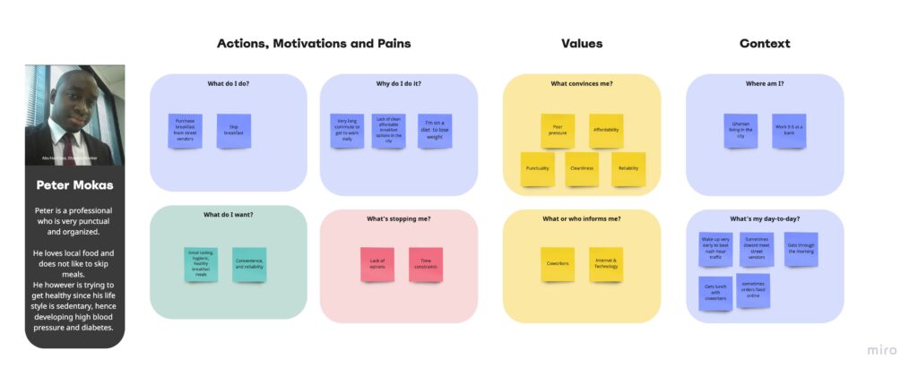
-Based on the information that was gathered during the quantitative and qualitative research phases, two personas were created to capture the recurring insights and behaviors to adequately gain insights into the best ways to solve the problem.
I created a persona for the office worker, and while creating it, I noticed that there was an opportunity to be explored with corporations since a small percentage of people interviewed got their breakfast provided at the office. People who fell under this category reported that it increased their punctuality by 90%.
Persona for individual
- Competitive research: A competitive analysis to understand how competitors solve similar problems and identify opportunities
- Product research: Analyzing insights and analytics from an existing product to understand user behavior
Problem Definition and Goal
After extensive research, it became clear what the goal was. And an application would be the best way to deliver value to users.
How might we provide a convenient way for corporate workers to access healthy tasty breakfast meals to improve their health and punctuality?
To tackle the issues faced in this space, the team decided to create the following solutions:
- A cross-platform mobile application for individual corporate individuals to order breakfast meals
- A web application optimized for desktop viewing targets Human resource departments to order bulk meals for their staff
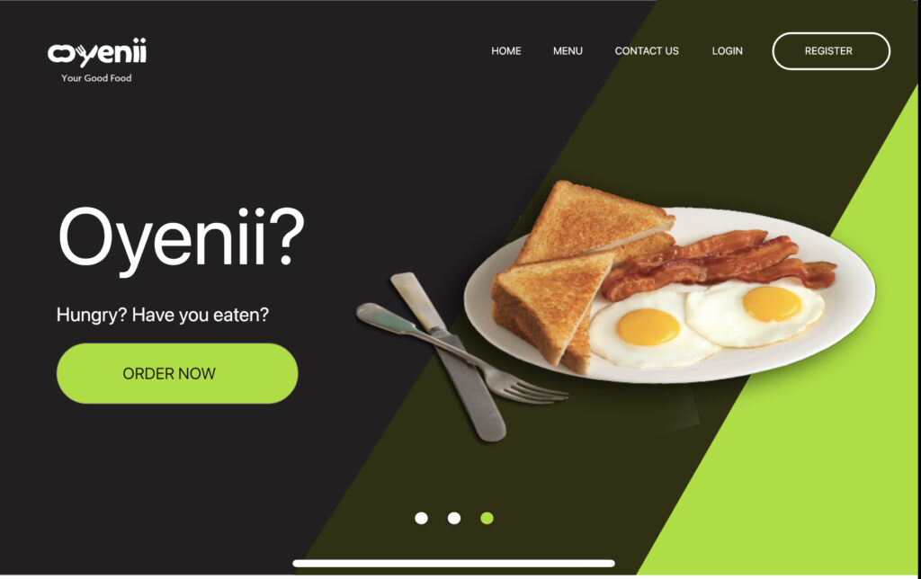
- A Landing page for converting online traffic
A series of functional requirements were fleshed out based on use cases, and I began to create low-fidelity wireframes which fulfilled the requirements.
Ideation
With a clear understanding of our users, the market, and the competitive landscape, I began the ideation phase. I initially used paper and pen during early ideation to iterate on many ideas fast.
To get a full scope of the designs, I employed the use of the following:
Information architecture: To ensure users were easily able to complete their use cases, they needed to be able to find them first. I employed a site map and ranked all the use cases in order of importance and how frequently a use case. I also employed a page hierarchy and website flow chart to simulate how users will interact with the app with usability and findability in mind. These were then presented to stakeholders to ensure that they aligned with business goals and that we were on the same page.
Sketching: I find sketching to be the fastest and easiest way to bring my ideas to life. Using my apple pencil and my app notes app, I quickly brought to life my vision for the main pages of the app and iterated quickly.
Image for sketches
Creating wireframes. Next, I used Miro to build a series of screens with only the key visual elements of the app to visualize how they fit together while employing usability and information architecture rules according to Don Norman and Dan brown.
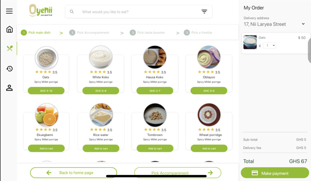
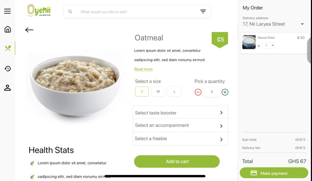
Creating prototypes. By this time, the marketing and graphic design team had come up with the logo, brand, and style guide, so I used that in collaboration with Material design 2’s design system to complete the high-fidelity prototypes for the web application, mobile app, and website landing page to simulate the actual interaction experience (the look and feel).
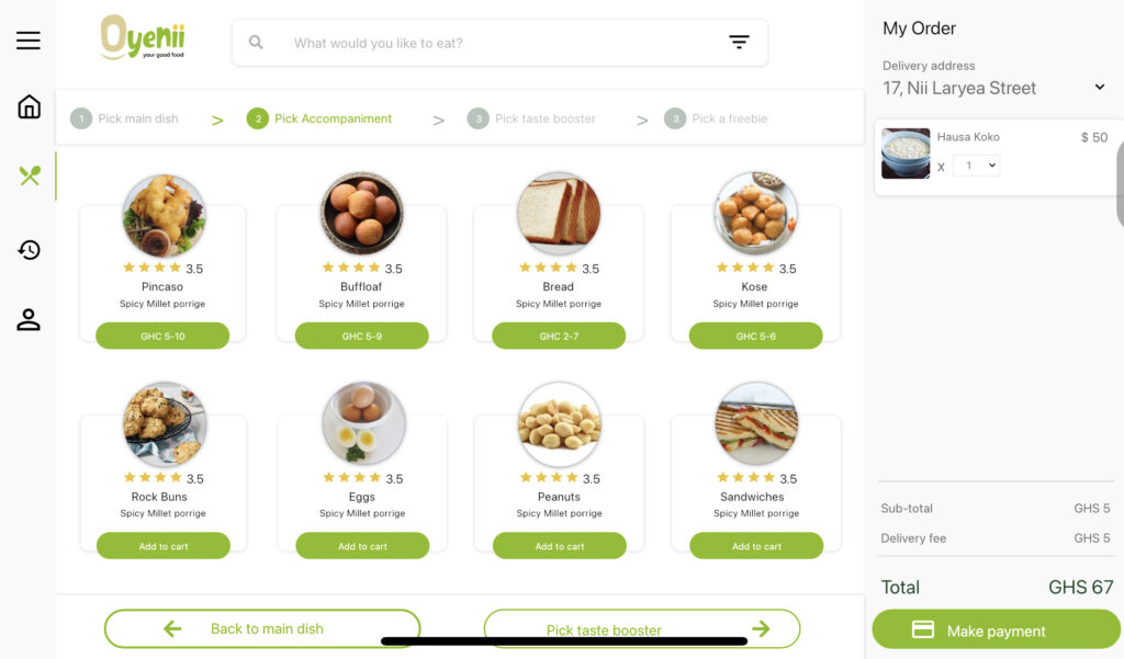
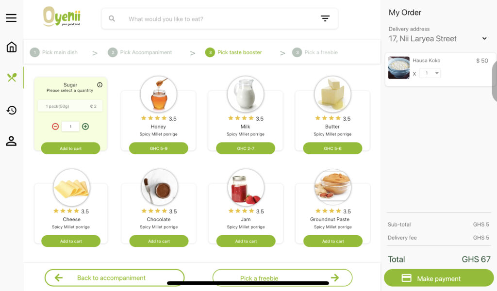
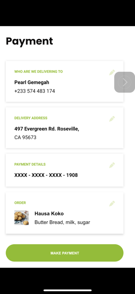
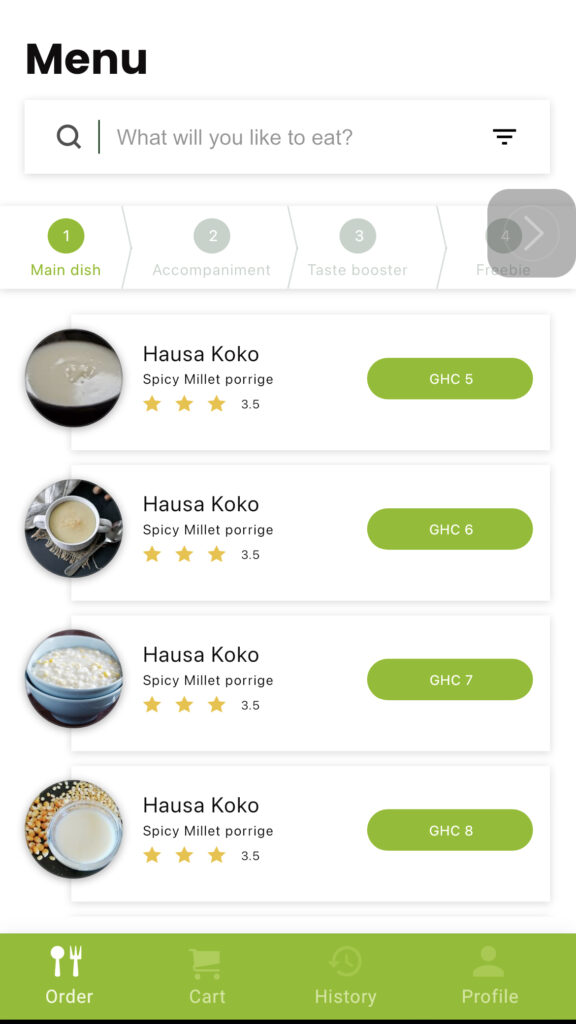
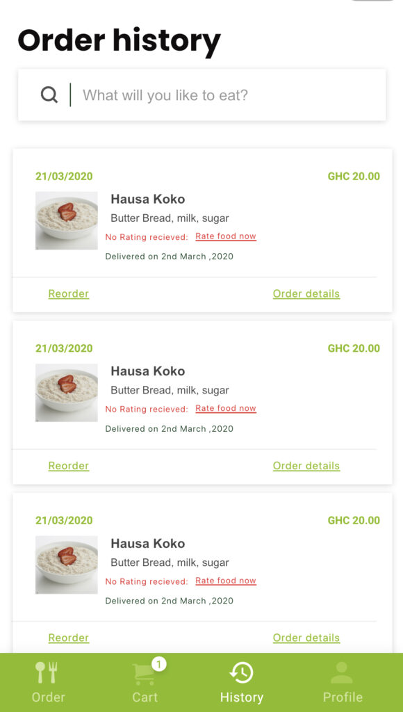
I built a low-fidelity wireframe for the mobile application and Web portal(a Clickable high-fidelity wireframe built with Adobe XD). I highlighted all the important views, including error messages, empty states, notifications and their timing, and annotations of suggested algorithms and business logic.
Also built a high-fidelity website for the company as well using HTML, CSS, and Javascript.
Usability testing- Validation
The moment of truth… drumroll, please.
This is the point that reveals whether my proposed design works for the target users. I tried to incorporate 2-3 usability tests with users with each stage of my design process so I don’t need to do a complete overhaul of the high-fidelity prototype since it can be time-consuming. This is also the point where the developers start working on components and preparing the hosting environments, so I try to avoid major surprises at this stage.
The validation phase of the UX process at this stage was done using unmoderated and moderated usability tests consisting of ten testers in the target demographics.
Key findings
- Users were confused with the pricing strategy since it wasn’t an itemized bill but rather package-based pricing.
- Users were not very comfortable with the delivery deadline since they had to order before 6 am to get their meals by 8 am
- Users wanted a better way to track deliveries and in-app messaging so that delivery calls don’t interrupt important meetings.
- Labeling of the sizes of food packs and calories was missing in the app and needed better clarification on that front.
- Some users wanted to make orders for others in the office, but the flow was optimized for single order.
- Allergy information was also missing from the list
- Local products need better descriptions for ex-pats in the Ghanaian corporate space
- Users found the app very straightforward to use and liked the guided progress bars at the top that helped them finish their orders step by step and without confusion
- Some users did not know what they wanted to eat the day before and find it very difficult to plan ahead hence; the app will not be suitable for their behavior
I handed off the designs to the dev team using zeplin and While the Dev team built the high-fidelity prototypes, I used excel to create a comprehensive quality assurance document which I used to test the finished coded work to ensure pixel-perfect designs, usability, and the absence of bugs using a pass and fail criteria.
Final Usability testing before launch
Analytics. Quantitative data (clicks, navigation time, search queries, etc.) from Google analytics were used to uncover how users interact with the product. This was mainly used on the Landing page website.
Inhouse Testing: Team members, including developers, sales, and management, tried using the product regularly, completing routine operations to uncover any major usability flaws.
Testing sessions. Moderated User testing sessions were organized with ten participants, 8 with testers who will use the food ordering platform, and two testers for the HR platform.
Take Aways
Building an app from scratch is very time-consuming, and it can be a wonderful adventure of problem exploration and ideation. It, however, can hit the thorns when you realize your solutions are not only meant for pleasing the users, but they must satisfy the stakeholders and investors as well.
Core features and processes in the app caused tension between myself and the business development team, especially about the ordering time and the pricing of food packages. After performing intensive user research, I was able to convince the team to switch to a clearer product pricing model and negotiated with the business development team to charge extra for orders that come after the threshold instead of cutting that customer segment off completely since a majority of Ghanaians are not planners by nature and are more impulsive.